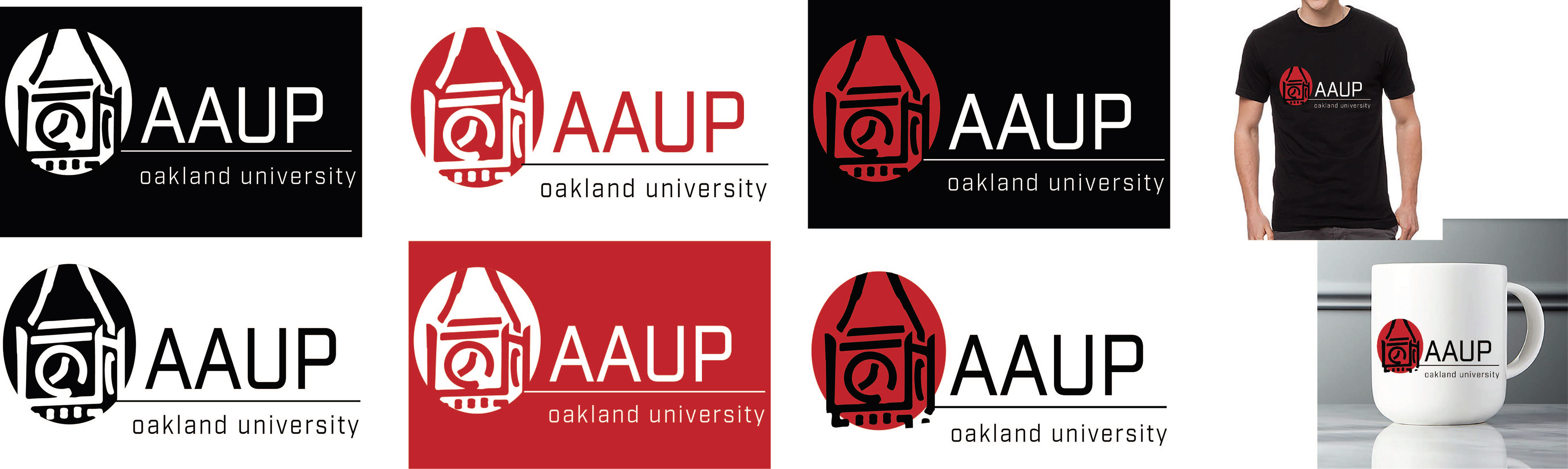
OPTION A
(Second place winner)
This logo is both traditional and modern at the same time. I got inspiration from the Elliot tower that is located at OU’s campus, I chose it because it makes the logo look sophisticated and proffesional. For the typeface, I used “Industry” because it makes the logo look proffesional but modern too.
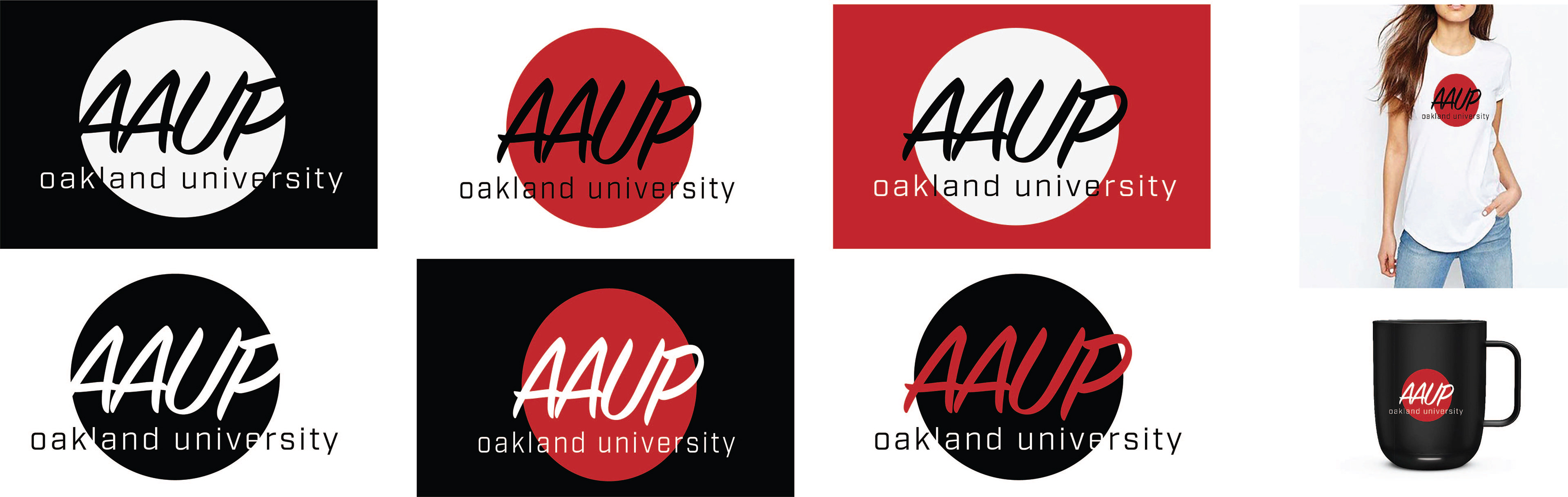
OPTION B
For this logo, I used two typefaces “SignPainter and Industry” to have better contrast between the roundish font and the geometrical one. The circle is the focal point and attracts the eye to read the acronym of the organization that is the protagonist.
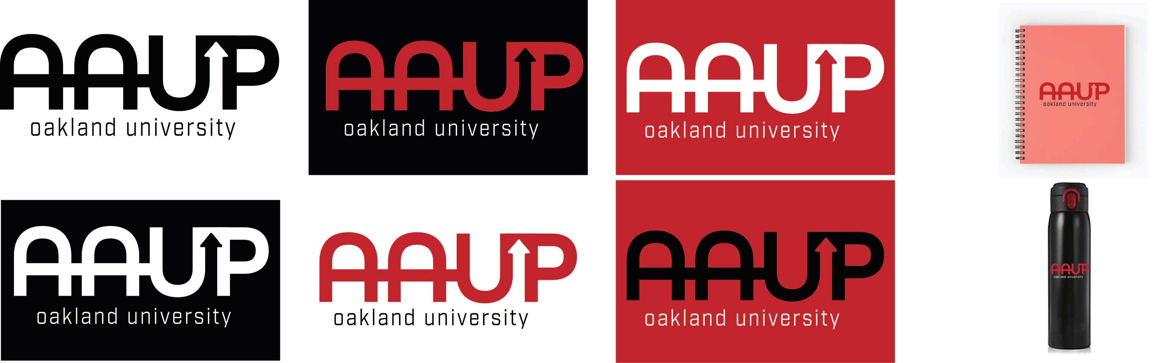
OPTION C
I used “All Round Gothic and Industry for this logo. I chose to create an arrow between the U and P because I wanted to represent AAUP’s mission (to define fundamental and professional values, and standards for higher education).